This painting has similar circular shapes that are in a horizontal movement pattern. They are broken up by the face which becomes proportionately more important then the circles.
The cats are ordered in visual importance; my eyes go to the small cat and spiral up to the medium sized cat, then to the large cat. So despite the dominance in size of the large cat, the alignment of the cats creates a different order of importance.
This image directs the viewer to the warrior, the darkness points to the white area of the image because of the direction of the darkness, and the positioning of the white area as the focal point.

Both of these illustrations show proportion.
The one on the left obviously shows the pig is smaller then the tree, but it also shows a movement pattern, the shading goes in an S like shape into the tree and behind the pig.
The image on the right shows unity, similarity, proximity & alignment. We can see that that we are closer to the tree in the foreground, and that the tree is in a forest.
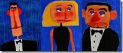
The two faces on the right are similar with square shaped faces and are aligned with each other. On the left, the long faced character on the left is asymmetrically aligned, put lower in the frame then the other two, which indicates the relationship between the three characters. We know through these elements that the guy on the left is the odd man out.
A diagonal composition is used in this painting, the opposing diagonal pattern of the rain against the umbrella's line creates the feeling of movement.


